
Website Style Guide
2022-2023
Authored by: Eduardo Zamora, Jane Ostler, and Andrea Genovesi
Introduction and Brand Voice
The National EMSC Data Center (EDC) uses data to improve emergency care for children. The EDC is funded by the Health Resources and Services Administration (HRSA) Emergency Medical Services for Children (EMSC) program. As a national resource center, we provide technical assistance for EMSC Programs and assets in developing their data capabilities.
This style guide was created for the emscDataCenter.org website in conjunction with logo and styling elements produced by the EMSC program for use among EMSC assets. Click on the links throughout this guide for additional context and information about EMSC brand-specific use.
The EDC’s customers are primarily EMSC State Partnership grantees, clinicians, and researchers looking for easy access to data collection, analysis, and utilization resources to further EMSC work on behalf of critically ill or injured children and their families.
The EDC uses data to improve emergency care for children.
The EDC is known for its professional, people-focused, approach and support of pediatric readiness quality improvement in prehospital and hospital settings. As a child-centric organization, the tone of our brand is calm, trustworthy, secure, and modern, reflecting the technologies that drive data to work on their behalf.
Our persona represents a community of collaborators across the spectrum of family and pediatric-focused networks, academia, research, emergency medicine, and government. The EDC website represents our dedication to supporting advancements in pediatric emergency care in each of these fields.
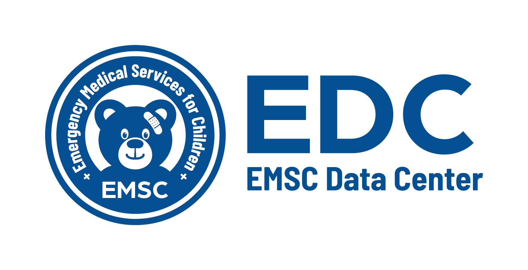
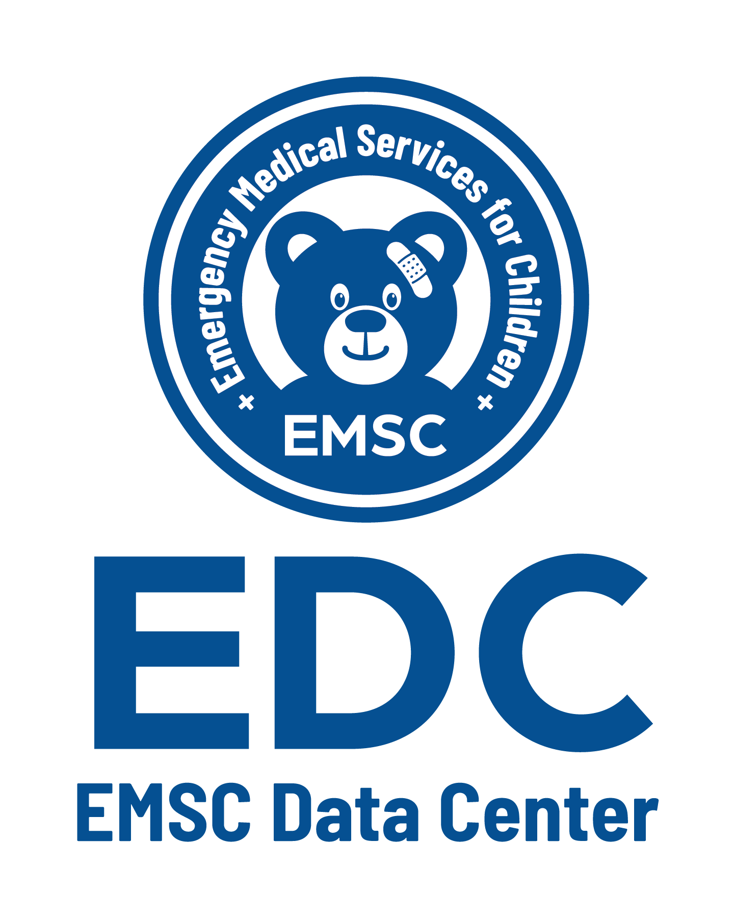
Logo Usage


Color Palette
Below is the color palette created specifically for use on the EDC website.
HEX
#045090
RGB
4, 80, 144
CMYK
97, 44, 0, 44
LAB
34, 5, -41
HEX
#90c1e1
RGB
144, 193, 225
CMYK
36, 14, 0, 12
LAB
76, -8, -21
HEX
#179d86
RGB
23, 157, 134
CMYK
85, 0, 15, 38
LAB
58, -39, 2
HEX
#a3dad2
RGB
175, 176, 176
CMYK
1, 0, 0, 31
LAB7
2, 0, 0
HEX
#afb0b0
RGB
175, 176, 176
CMYK
1, 0, 0, 31
LAB
72, 0, 0
HEX
#f0f0f0
RGB
240, 240, 240
CMYK
0, 0, 0, 6
LAB
94.796, -0
Typography
The Open Sans font family will be used as it is the most recognizable and used font for websites.
Lorem ipsum dolor sit amet
H1
Open Sans, 60px, ExtraBold
Lorem ipsum dolor sit amet
H2
Open Sans, 48px, ExtraBold
Lorem ipsum dolor sit amet, consectetur adipiscing elit.
H3
Open Sans, 36px, ExtraBold
Lorem ipsum dolor sit amet, consectetur adipiscing elit.
H4
Open Sans, 30px, ExtraBold
Lorem ipsum dolor sit amet, consectetur adipiscing elit.
H5
Open Sans, 24px, ExtraBold
Lorem ipsum dolor sit amet, consectetur adipiscing elit.
H6
Open Sans, 20px, ExtraBold
Lorem ipsum dolor sit amet, consectetur adipiscing elit. Suspendisse varius enim in eros elementum tristique. Duis cursus, mi quis viverra ornare, eros dolor interdum nulla, ut commodo diam libero vitae erat.
Lorem ipsum dolor sit amet, consectetur adipiscing elit. Suspendisse varius enim in eros elementum tristique. Duis cursus, mi quis viverra ornare, eros dolor interdum nulla, ut commodo diam libero vitae erat.
BB1
Open Sans, 20px, Bold
B1
Open Sans, 20px, Normal
Lorem ipsum dolor sit amet, consectetur adipiscing elit. Suspendisse varius enim in eros elementum tristique. Duis cursus, mi quis viverra ornare, eros dolor interdum nulla, ut commodo diam libero vitae erat.
Lorem ipsum dolor sit amet, consectetur adipiscing elit. Suspendisse varius enim in eros elementum tristique. Duis cursus, mi quis viverra ornare, eros dolor interdum nulla, ut commodo diam libero vitae erat.
BB1
Open Sans, 18px, Bold
B1
Open Sans, 18px, Normal
Lorem ipsum dolor sit amet, consectetur adipiscing elit. Suspendisse varius enim in eros elementum tristique. Duis cursus, mi quis viverra ornare, eros dolor interdum nulla, ut commodo diam libero vitae erat.
Lorem ipsum dolor sit amet, consectetur adipiscing elit. Suspendisse varius enim in eros elementum tristique. Duis cursus, mi quis viverra ornare, eros dolor interdum nulla, ut commodo diam libero vitae erat.
BB1
Open Sans, 16px, Bold
B1
Open Sans, 16px, Normal
Lorem ipsum dolor sit amet, consectetur adipiscing elit. Suspendisse varius enim in eros elementum tristique. Duis cursus, mi quis viverra ornare, eros dolor interdum nulla, ut commodo diam libero vitae erat.
Lorem ipsum dolor sit amet, consectetur adipiscing elit. Suspendisse varius enim in eros elementum tristique. Duis cursus, mi quis viverra ornare, eros dolor interdum nulla, ut commodo diam libero vitae erat.
BB1
Open Sans, 14px, Bold
B1
Open Sans, 14px, Normal
Layout, Spacing and Scalability
The spacing and layout of the website depend on the sizing, measuring, and spacing of items. The rules will be applied to WordPress using HTML and CSS.
The base unit defines what every measurement will be a multiple of. For scaling and use with multiple devices, the base unit will be 8px.
Padding is the white space in between the elements and will also be organized in increments of the base unit of 8pt (16pt).
8px
16px
24px
32px
40px
48px
56px
60px
The height and width of any user interface element should be organized in increments of the base unit. In the example below, the width of all the elements are all divisible by the base unit of 8pt (16pt, 24pt, 48pt, and 96pt)
192px
Buttons
Buttons or any additional user interface elements will also conform to the 8pt
base unit. Buttons reflect potential actions when clicked on or hovered over. This is indicated with different states, color, or text. Stylistic considerations for the shape of the button (e.g. round, oval, square) may impact user interface.
Icons, Images, and Illustrations
JPEG has to be used for a photo and PNG has to be used for illustrations. Both should be scalable.
Outline Stylistic Considerations
Appearance, sizes, states of buttons, form fields, form elements, navigation menus, notifications and alters, cards, modals, etc.
Dos and Don’ts
- Do connect back to the homepage by clicking on the logo from any page.
- Do be consistent with EDC and EMSC jargon. For example, Pediatric Readiness vs. PedsReady or EDC vs. EMSC Data Center.
- Do be consistent with word usage. For example, if the document you are working with is referred to as a ‘user guide’, be consistent with that term instead of multiple inferences like ‘companion document’ or ‘manual’.
- Do be consistent with number formatting choosing only one. For example, 2., 2), or II.
- Do not use multiple fonts. Choose a primary font and a secondary font for body text and use throughout.
- Do not deviate from the color palette.
- Do not assume you can change or alter the EDC or EMSC logos to fit within the parameters of the website. Always review the EMSC Branding Guide first.
- All images must have an image title for 508 compliance
- If a button links to an external website must include .org, .com, .center. For example, pediatricreadiness.org.